Following our recent deployment UI release 2.14, check out our 4 improvements!
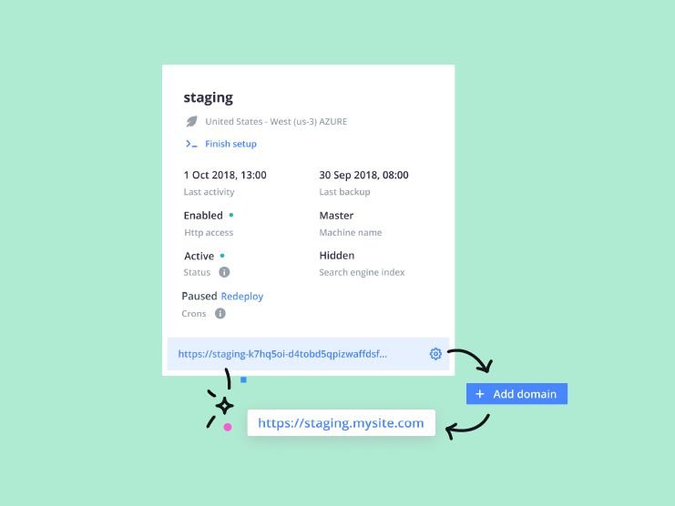
First, you will find 2 new flexibilities in branch naming and their display in the UI. See how the long branch name will display in better way and would be visible on hover too.
- Long branch/environment name
- Display branch name on hover
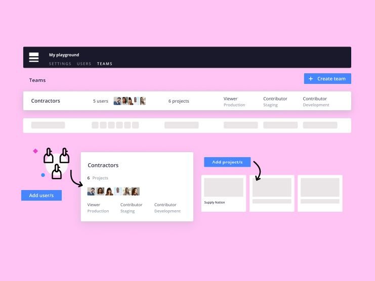
Second, you can see a simpler interface to improve user management under project settings.
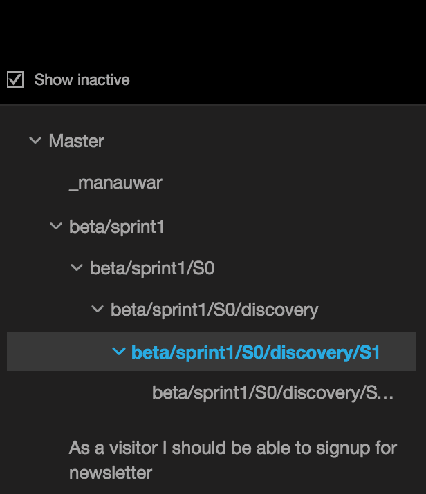
- Nested branching
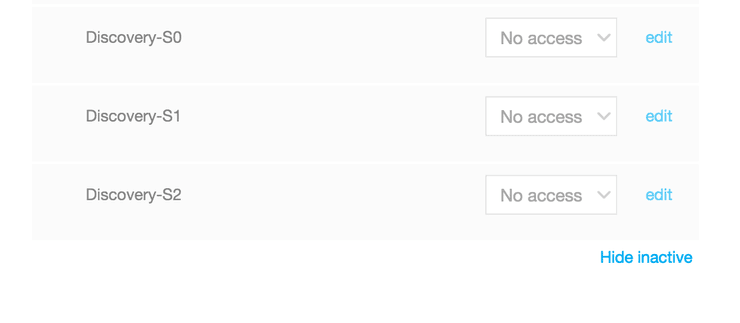
- Show inactive/Hide inactive
Long branch/environment name
Platform.sh lets you differentiate your multiple environments by giving you more flexibility in the naming. Whether they are for new features or release environments, you can now have your branch names as long as you want or need them to be.
Display branch name on hover
Of course having long branch names needs more space in the UI, which restricts the display. This might create confusion for you when you need to activate or deactivate any environment.
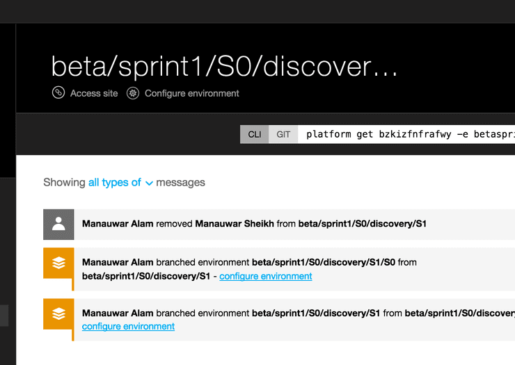
Don’t worry! It’s our job to make sure you can see the full branch name whenever its needed. :)

For more information on Git branching, read up on our last post on Gitflow.
Better interface for User management
As an Account owner of a project who manages multiple users across different environments might be complex, especially when you have a large number of environments. That’s because you need to make sure each user has the right role and permissons all the time.
Good news! We’ve made your job to oversee your users and environments a lot easier with this new, improved interface. Now all your active/inactive environments are visible under a nested structure. No more confusion! :)
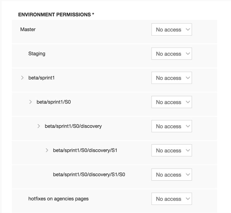
Also, You now have a handy “Show inactive/Hide inactive” button at the bottom for active/inactive environments.
 If you have any feature requests or other feedback, please contact us on sayhello@platform.sh
 Switching to Platform.sh can help IT/DevOps organizations drive 219% ROI
 Organizations, the ultimate way to manage your users and projects
